
This is the finished image of the advert on Photoshop. There were many different stages to the process of constructing our advert which consisted of using various different methods to make it look appealing and attractive to an audience who will view it as a potential consumer of our artist product.
Image

We aimed to link our advert keenly to our Digipak. Based on this, we decided to use the picture of the heads of the three band members lying down facing up towards the sky. We decided to use this for our advert cover as well as a picture for our digipak based on the fact that it includes all of the group members so people viewing it can easily acknowledge that our artist is a band. Also, the picture is rather abstract and different which we believe could be seen as a unique selling point for our artist. Overall, we agreed that this was the best picture to use for our advert cover and believe it is a strong and valid representation of our artists.

Lightening the image

We used the blending and colour tool in Photoshop to make the area around our heads a whiter shade as we believed the brighter colour compared to the darker and murkier greyish colour used in the image for our digipak would be more eye-catching and attractive for an audience looking at a magazine cover.
Name of Artist
There was debate about the position to put the title of our band on the advert cover. Originally we had thought to place it at the bottom of the advert cover but after some research and looking at real life examples such as an advert of the Arctic Monkey's album we decided that it would be better to locate the title of our band at the top of the advert cover.

The title of our band would be placed in a similar position to that seen above which is effective as it allows the audience to see the title of our band quickly and the impacting nature of the band being at the top of the screen means that consumers are appeased by the user friendly nature of our advert cover.
Font

Originally we used the "Arial Black" font that was rather statutory and basic for our advert cover until we placed at the top of the advert cover and found that it was not attractive or stimulating to look at. We soon realised that we would need to bring a font that encompassed more spice and Jazz to make our advert appealing to a consumer and make them more inclined to purchase the product we have on service.
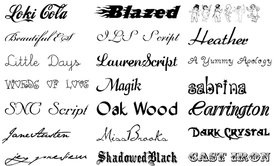
After deciding that the font that we used originally was too basic for our liking we decided to amp up the tempo a bit more and use a more interesting and dynamic font for our advert cover. The fonts seen above are some of the example fonts we used and experimented with before deciding to use the "Blackoak" font which was more advanced then the simplistic font we used at the beginning.
Ratings and Website


We believe that the names we created for our rating companies were strong. We used BCO and Tuneview which were both imaginary organisations who sound like they could be companies involved in the music industry. BCO is an acronym that sounds interesting and potentially could be an organisation involved in music. Tuneview is a Jazzy and authentic name that would evidently be involved in music so this is user friendly as they can relate the name to the music industry instantaneously.
QR Code

We deemed it essential to add in a QR code onto our magazine cover for the advert of our artist based on the fact that it is almost on every advert in real life in modern day. This makes our advert realistic and less likely for people to view our work and say no that is clearly not real. We experienced some problems when we were placing the QR code onto the advert based on the fact that it did not look attractive at first when we placed it on the left in ratio with the other features of our advert. After speculation we finally decided to place the QR code in the centre of our advert page as this would mean that it was better placed in relation to the other aspects and build up of our advert cover.

No comments:
Post a Comment